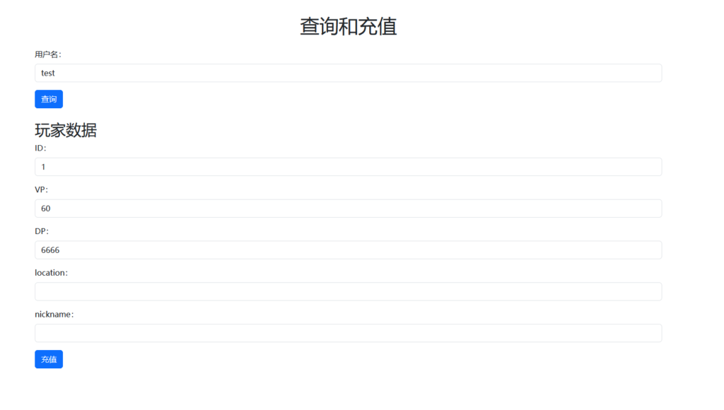

You can place the label and the input field on the same line by wrapping them together in a single line. You can use CSS styling to layout the label and the input field so that they appear in the same row.
Here is an example HTML code snippet where the `label` and `input` elements are placed on the same line:
<div class="form-group">
  <label for="phone" class="form-label">手机号:</label>
  <input type="tel" class="form-control" placeholder="请输入手机号" id="phone" name="phone"
    pattern="^1[3|4|5|6|7|8|9][0-9]{9}$" required>
</div>
In the above code, we have used one.divWrap the `label` and `input` elements within a container, then use CSS styles to layout them. You can arrange them in the same line using the following CSS styles:
.form-group {
  display: flex;
  flex-direction: column;
}

.form-label {
  margin-bottom: 10px;
}

.form-control {
  padding: 10px;
  border: none;
  border-bottom: 2px solid #ccc;
}
In the above CSS style, we have useddisplay: flexUse the `attribute` to wrap the `label` and `input` elements within a `flex` container, and then apply it.flex-direction: columnUse the `attribute` to vertically arrange containers. We have also added some styling to the `label` and `input` elements to make them easier to identify and more readable.
When using a Flex container, you can use it.margin-bottomApply a bottom border to the `label` attribute – use this.paddingApply padding to the `input` attribute and use it.border-bottomApply a bottom border to the `input` attribute.