

Create a double-sided card that rotates on hover.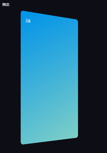
Set the card's to None. backface-visibility
Initially, set the back of the card to and the front to . rotateY()-180deg0deg
On hover, set front to and back . rotateY()180deg0deg
Set appropriate values to create a rotation effect. perspective
<div class="card">
  <div class="card-side front">
    <div>Front Side</div>
  </div>
  <div class="card-side back">
    <div>Back Side</div>
  </div>
</div>
.card {
  perspective: 150rem;
  -webkit-perspective: 150rem;
  -moz--perspective: 150rem;
  position: relative;
  height: 40rem;
  max-width: 400px;
  margin: 2rem;
  box-shadow: none;
  background: none;
}

.card-side {
  height: 35rem;
  border-radius: 15px;
  transition: all 0.8s ease;
  backface-visibility: hidden;
  position: absolute;
  top: 0;
  left: 0;
  width: 80%;
  padding:2rem;
  color: white
}

.card-side.back {
  transform: rotateY(-180deg);
  background-color: #4158D0;
  background-image: linear-gradient(43deg, #4158D0 0%,#C850C0 46%, #FFCC70 100%);
}

.card-side.front {
  background-color: #0093E9;
  background-image: linear-gradient(160deg, #0093E9 0%, #80D0C7 100%);
}

.card:hover .card-side.front {
  transform: rotateY(180deg);
}

.card:hover .card-side.back {
  transform: rotateY(0deg);
}