

In the mobile terminal, REM is used to change the root HTML, and the mobile terminal adaptation is realized through a piece of JS. This article uses pure CSS viewport units to self-adapt. Although the current compatibility is not fully acceptable, it does not prevent you from recognizing the power of vw and vh. The implementation of responsive layout relies on media queries (Media Queries). Select the width size of mainstream devices as breakpoints to write additional styles for adaptation. However, this will be troublesome and can only provide perfect adaptation under a few selected mainstream device sizes. Even if adaptation is implemented through rem units, a script needs to be embedded to dynamically calculate the size of the root element. In recent years, as the support for viewport units on mobile terminals has become more mature and widespread, we can try a new method to truly adapt to all device sizes.
Understanding Viewport units
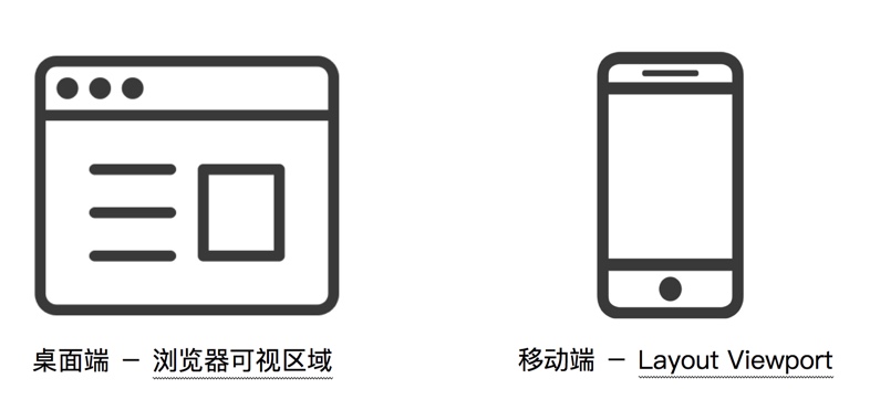
First, we need to understand what a viewport is. In the industry, a highly respected theory is the explanation of the viewport put forward by Peter-Paul Koch (known as the "PPK Master" in the world) - on the desktop, the viewport refers to the desktop and the visible area of the browser; while on the mobile side it is more complicated and involves three viewports: Layout Viewport (layout viewport), Visual Viewport (visual viewport), and Ideal Viewport. The "viewport" in the viewport unit undoubtedly refers to the visible area of the browser on the desktop; but on the mobile side, it refers to the Layout Viewport among the three Viewports. The "viewport" in the viewport unit. According to the CSS3 specification, the viewport unit mainly includes the following four:
vw: 1vw is equal to 1% of the viewport width
vh: 1vh is equal to 1% of the viewport height
vmin: Select the smallest one between vw and vh
vmax: select the largest one between vw and vh
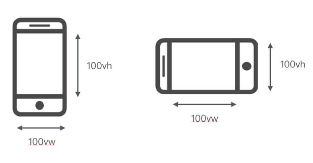
The viewport unit is different from the % unit. The viewport unit depends on the size of the viewport and is defined as a percentage of the viewport size; while the % unit depends on the ancestor element of the element. Measured in viewport units, the viewport width is 100vw and the height is 100vh (the left side is the vertical screen and the right is the horizontal screen). For example, if the viewport size of the desktop browser is 650px, then 1vw = 650 * 1% = 6.5px (this is a theoretical calculation. If the browser does not support 0.5px, the actual rendering result may be 7px).
Compatibility
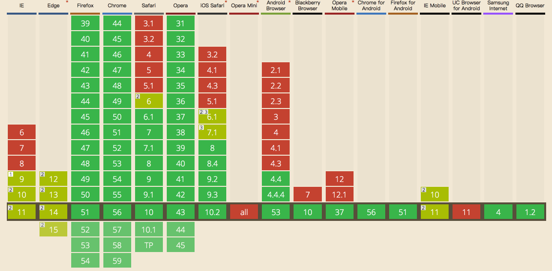
Its compatibility is shown in the figure below. You can know that it is supported on mobile iOS 8 and above and Android 4.4 and above, and it is also fully supported in the WeChat x5 kernel. Screenshots from Can I Use Screenshots from X5 Kernel-Can I Use
Adapting the page using viewport units For mobile terminal development, the most important point is how to adapt the page to achieve multi-terminal compatibility. Different adaptation methods have their own advantages and disadvantages. As for the mainstream responsive layout and flexible layout, the layout implemented through Media Queries requires the configuration of multiple response breakpoints, and the experience it brings is also very unfriendly to users: the layout remains unchanged at the resolution within the range of the response breakpoints, and at the moment when the response breakpoint is switched, the layout brings about discontinuous switching changes, like a cassette record player "clicking" again and again. By using the dynamic calculation of rem units for flexible layout, a script needs to be embedded in the header to monitor changes in resolution and dynamically change the font size of the root element, coupling CSS and JS together. Is there any way to solve such a problem? The answer is yes. By using the viewport unit to implement an adapted page, it can solve both the responsive fault problem and the script dependency problem.
Practice one
Only use vw as the CSS unit. Under this approach of only using the vw unit as the only applied CSS unit, we comply with: 1. To convert the size of the design draft into vw units, we use the Sass function to compile
  //iPhone 6尺寸作为设计稿基准

  $vm_base: 375;

  @function vw($px) {

  @return ($px / 375) * 100vw;

  } 2.无论是文本还是布局高宽、间距等都使用 vw 作为 CSS 单位

  .mod_nav {

  background-color: #fff;

  &_list {

  display: flex;

  padding: vm(15) vm(10) vm(10); // 内间距

  &_item {

  flex: 1;

  text-align: center;

  font-size: vm(10); // 字体大小

  &_logo {

  display: block;

  margin: 0 auto;

  width: vm(40); // 宽度

  height: vm(40); // 高度

  img {

  display: block;

  margin: 0 auto;

  max-width: 100%;

  }

  }

  &_name {

  margin-top: vm(2);

  }

  }

  }

  }
3.1 The physical pixel line (that is, 1px on a normal screen and 0.5px on a high-definition screen) is implemented using the transform attribute scale.
  .mod_grid {

  position: relative;

  &::after {

  // 实现1物理像素的下边框线

  content: '';

  position: absolute;

  z-index: 1;

  pointer-events: none;

  background-color: #ddd;

  height: 1px;

  left: 0;

  right: 0;

  top: 0;

  @media only screen and (-webkit-min-device-pixel-ratio: 2) {

  -webkit-transform: scaleY(0.5);

  -webkit-transform-origin: 50% 0%;

  }

  }
  }
4. For images that need to maintain the aspect ratio, padding-top should be used instead.
  .mod_banner {

  position: relative;

  padding-top: percentage(100/700); // 使用padding-top

  height: 0;

  overflow: hidden;

  img {

  width: 100%;

  height: auto;

  position: absolute;

  left: 0;

  top: 0;

  }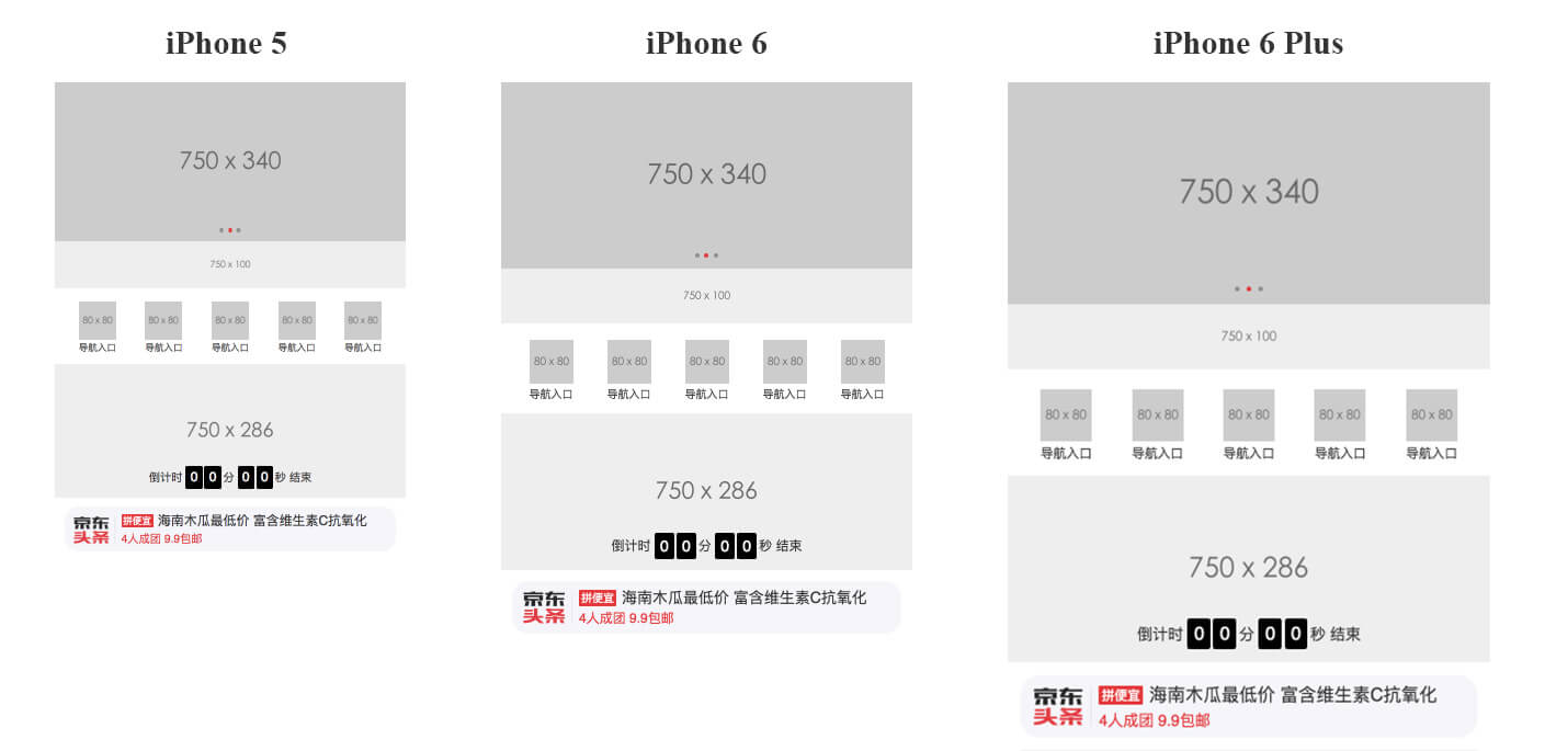
From this, we can achieve a common layout page effect as follows: Click here to experience the address
Method 2
With vw and rem, the layout is more optimized. Although such a page looks well adapted, you will find that because it is a layout implemented using viewport units, it automatically scales depending on the viewport size. No matter the viewport is too large or too small, it also loses the maximum and minimum width restrictions as the viewport becomes too large or too small. Of course, you don’t have to care about such a small unfriendly user experience, but we still try to fix such small flaws. So, I thought it would be better to combine rem units to implement layout? The core of rem flexible layout is to dynamically change the size of the root element, then we can use:
Set the vw unit for the size of the root element that changes as the viewport changes, so that its size can be dynamically changed.
Limit the maximum and minimum font size of the root element, combined with body plus maximum width and minimum width
In this way we can achieve maximum and minimum restrictions on the layout width. Therefore, based on the above conditions, we can conclude that the code implementation is as follows:
  // rem 单位换算:定为 75px 只是方便运算,750px-75px、640-64px、1080px-108px,如此类推

  $vm_fontsize: 75; // iPhone 6尺寸的根元素大小基准值

  @function rem($px) {

  @return ($px / $vm_fontsize ) * 1rem;

  }

  // 根元素大小使用 vw 单位

  $vm_design: 750;

  html {

  font-size: ($vm_fontsize / ($vm_design / 2)) * 100vw;

  // 同时,通过Media Queries 限制根元素最大最小值

  @media screen and (max-width: 320px) {

  font-size: 64px;

  }

  @media screen and (min-width: 540px) {

  font-size: 108px;

  }

  }

  // body 也增加最大最小宽度限制,避免默认100%宽度的 block 元素跟随 body 而过大过小

  body {

  max-width: 540px;

  min-width: 320px;

  }
No screenshots will be given here, but you can click here to experience the online address.
Summary Compared with method one, I personally prefer method two for the following two reasons: First, method two provides a better user visual experience and increases the maximum and minimum width restrictions; second, and more importantly, if you choose the mainstream rem flexible layout method as the adaptive page method for project development, then method two is more suitable for later projects to transition from rem units to vw units. Just by changing the calculation method of the root element size, you can seamlessly transition to another CSS unit without any other processing. What's more, the use of vw units will inevitably become a better adaptation method. Currently, it is only limited by compatibility support and is not widely used.